Items related to Jan van Toorn: Critical Practice (Graphic Design in...
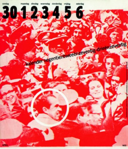

Jan van Toorn is one of the most significant and influential Dutch graphic designers to have emerged since the early 1960s. His designs persistently call attention to their status as visual contrivances, obliging the viewer to make an effort to process their complexities. Van Toorn wants the public to measure the motives of both the client and the designer who mediates the client’s message against their own experiences of the world. He hoped in this way to stimulate a more active and skeptical view of art, communication, media ownership and society. Projects such as Van Toorn’s posters and catalogues for the Van Abbemuseum in Eindhoven and his long-running series of calendars for the printing firm Mart.Spruijt are powerful demonstrations of graphic design used as a means of commentary and as a tool of critique. Later, as director of the Jan van Eyck Academy, Van Toorn drew together all the strands of his critical practice into a multi-levelled educational initiative that urged designers to think harder about design’s role in shaping contemporary reality.
"synopsis" may belong to another edition of this title.
Review:
One of the most outspoken conflicts between two designers holding diametrically opposed views occurred in the Netherlands in the 70s, and it lasted for at least a decade. That might sound too remote in time to matter any more, but both participants, Wim Crouwel and Jan van Toorn, remain in the public eye, and the points they made with unswerving fidelity to their carefully defined positions pre-figure some of the most significant themes running through design in the last three decades. Their ideas continue to mark out the possibilities, and limits, of practice. Crouwel will be most familiar, perhaps, from his appearance in the Helvetica documentary, though his inclusion represents just a small part of the admiration that his body of work attracts among younger designers. I m a modernist, you know, he says in the film. I was trained in the period. I lived in the period. I love modernism. Crouwel was the first graphic designer I ever interviewed. It was 1987, and he had recently been appointed director of the Museum Boijmans Van Beuningen in Rotterdam. The work that made his name in the 60s, as cofounder of Total Design in Amsterdam, was long behind him, postmodernism was the rage, and Crouwel was, to put it bluntly, out of fashion. But thanks to some well-placed British admirers, such as 8vo who collaborated with him at the museum Crouwel was back in the limelight by the end of the 90s, the perfection of his modernist typography celebrated around the world, his work highly collectible. Van Toorn s influence has been of a different kind. A notable educator, as well as a designer, he was an associate professor at RISD for 20 years and last year, he was the subject of a retrospective exhibition at the Maryland Institute in Baltimore. Van Toorn has a reputation for being uncompromising in his design work, for being motivated by strong social and political convictions, and for his commitment to cultural theory, which has sometimes baffled more pragmatically minded Dutch colleagues. I have enjoyed a stimulating dialogue with Van Toorn over the years, and I recently published a monograph about him in the Netherlands. By the late 60s, the acute differences in Crouwel s and Van Toorn s views of the design task were clear. Where Crouwel s posters and catalogs for the Stedelijk Museum in Amsterdam are harmoniously resolved typographic constructions, generally using a single typeface Helvetica Van Toorn s posters and catalogs for the Van Abbemuseum in Eindhoven take a messier, more promiscuous approach to type. They find their form in the artists imagery, and each one looks different than the last. If Crouwel aspired to produce work that appeared timeless, as though the ultimate aim was the gallery wall, Van Toorn preferred designs that were informal, personal, provisional, and situated in their cultural and political moment. In 1972, at a public debate in Amsterdam that has acquired an almost legendary status in the annals of Dutch design, the two locked horns for the first time. In Helvetica, Crouwel recalls how committed he was in those years to the idea of neutrality that Helvetica represented. The type shouldn t have a meaning in itself: the meaning resided in the content of the text. In Crouwel s view, the subjectivity of Van Toorn s approach was wrong because it meant that designers could only work on projects that they personally supported. You must not try . . . to get the message across better than the one who is emitting the message, said Crouwel. Van Toorn agreed that the designer s task was to convey the content, but insisted that designers still had a crucial contribution of their own to make. Crouwel s fear of subjective interference leads to uniformity, causing a distinct identity to disappear, he said. As the decade progressed, Van Too --Print Magaziine Aug 2008
"About this title" may belong to another edition of this title.
- Publishernai010 publishers
- Publication date2013
- ISBN 10 9064505659
- ISBN 13 9789064505652
- BindingHardcover
- Number of pages240
- Rating
Top Search Results from the AbeBooks Marketplace

Seller Image
Jan van Toorn Critical Practice (Graphic Design in the Netherlands #3)
Published by
Rotterdam, nai 010 uitgevers
(2013)
ISBN 10: 9064505659
ISBN 13: 9789064505652
Used
Softcover
Quantity: 1
Seller:
Rating
Book Description 2008, sewn paperback, 240 pp., in fine condition. Seller Inventory # 227696535
Buy Used
US$ 220.41
Convert currency
Seller Image
Jan van Toorn: Critical Practice (Graphic Design in the Netherlands)
Published by
nai010 publishers, Rotterdam
(2008)
ISBN 10: 9064505659
ISBN 13: 9789064505652
Used
Soft cover
First Edition
Quantity: 1
Seller:
Rating
Book Description Soft cover. Condition: Very Good. 1st Edition. Stiff wrappers (softcover), 239p. : illustrations (chiefly in color), 27 cm. Very good, clean, no internal marks, wrappers/spine slightly sunned. Scarce. Seller Inventory # JHJ_2023_03_22_6
Buy Used
US$ 413.28
Convert currency