
Items related to Show Me the Numbers: Designing Tables and Graphs to...
Synopsis
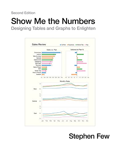
Most presentations of quantitative information are poorly designed—painfully so, often to the point of misinformation. This problem, however, is rarely noticed and even more rarely addressed. We use tables and graphs to communicate quantitative information: the critical numbers that measure the health, identify the opportunities, and forecast the future of our organizations. Even the best information is useless, however, if its story is poorly told. This problem exists because almost no one has ever been trained to design tables and graphs for effective and efficient communication. Show Me the Numbers: Designing Tables and Graphs to Enlighten is the most accessible, practical, and comprehensive guide to table and graph design available.
The second edition of Show Me the Numbers improves on the first by polishing the content throughout (including updated figures) and adding 91 more pages of content, including: 1) A new preface; 2) A new chapter entitled "Silly Graphs That Are Best Forsaken," which alerts readers to some of the current misuses of graphs such as donut charts, circle charts, unit charts, and funnel charts; 3) A new chapter about quantitative narrative entitled "Telling Compelling Stories with Numbers"; and 4) New appendices entitled "Constructing Table Lens Displays in Excel," "Constructing Box Plots in Excel," and "Useful Color Palettes."
"synopsis" may belong to another edition of this title.
About the Author
Stephen Few is the founder of the consultancy Perceptual Edge. He speaks, teaches, and consults around the world and writes the quarterly Visual Business Intelligence Newsletter. He is also the author of Information Dashboard Design: Displaying Data for At-a-Glance Monitoring, Now You See It: Simple Visualization Techniques for Quantitative Analysis, and Signal: Understanding What Matters in a World of Noise.
"About this title" may belong to another edition of this title.
Search results for Show Me the Numbers: Designing Tables and Graphs to...

Stock Image
Show Me the Numbers: Designing Tables and Graphs to Enlighten
Seller: World of Books (was SecondSale), Montgomery, IL, U.S.A.
Seller rating 5 out of 5 stars

Hardback. Condition: Good. Addressing the prevalent issue of poorly designed quantitative information presentations, this accessible, practical, and comprehensive guide teaches how to properly create tables and graphs for effective and efficient communication. The critical numbers that measure the health, identify the opportunities, and forecast the future of organizations are often misrepresented because few people are trained to design accurate, informative materials, but this manual helps put an end to misinformation. This revised edition of the highly successful book includes updated figures and 91 additional pages of content, including new chapters about quantitative narrative and current misuses of graphs--such as donut, circle, unit, and funnel charts--and new appendices that cover constructing table lens displays and box plots in Excel and useful color palettes for presentation materials. Seller Inventory # 00109888801
Stock Image
Show Me the Numbers: Designing Tables and Graphs to Enlighten
Seller: HPB-Red, Dallas, TX, U.S.A.
Seller rating 5 out of 5 stars
Hardcover. Condition: Good. Connecting readers with great books since 1972! Used textbooks may not include companion materials such as access codes, etc. May have some wear or writing/highlighting. We ship orders daily and Customer Service is our top priority! Seller Inventory # S_478063023
Stock Image
Show Me the Numbers: Designing Tables and Graphs to Enlighten
Seller: Evergreen Goodwill, Seattle, WA, U.S.A.
Seller rating 5 out of 5 stars
hardcover. Condition: Acceptable. Seller Inventory # mon0000814296
Seller Image
Show Me the Numbers: Designing Tables and Graphs to Enlighten
Seller: Goodwill Books, Hillsboro, OR, U.S.A.
Seller rating 5 out of 5 stars
Condition: acceptable. Fairly worn, but readable and intact. If applicable: Dust jacket, disc or access code may not be included. Seller Inventory # GICWV.0970601972.A
Stock Image
Show Me the Numbers: Designing Tables and Graphs to Enlighten
Seller: World of Books (was SecondSale), Montgomery, IL, U.S.A.
Seller rating 5 out of 5 stars
Hardback. Condition: Very Good. Addressing the prevalent issue of poorly designed quantitative information presentations, this accessible, practical, and comprehensive guide teaches how to properly create tables and graphs for effective and efficient communication. The critical numbers that measure the health, identify the opportunities, and forecast the future of organizations are often misrepresented because few people are trained to design accurate, informative materials, but this manual helps put an end to misinformation. This revised edition of the highly successful book includes updated figures and 91 additional pages of content, including new chapters about quantitative narrative and current misuses of graphs--such as donut, circle, unit, and funnel charts--and new appendices that cover constructing table lens displays and box plots in Excel and useful color palettes for presentation materials. Seller Inventory # CIN0970601972VG
Stock Image
Show Me the Numbers: Designing Tables and Graphs to Enlighten
Seller: World of Books Inc, Montgomery, IL, U.S.A.
Seller rating 4 out of 5 stars

Hardback. Condition: Good. Addressing the prevalent issue of poorly designed quantitative information presentations, this accessible, practical, and comprehensive guide teaches how to properly create tables and graphs for effective and efficient communication. The critical numbers that measure the health, identify the opportunities, and forecast the future of organizations are often misrepresented because few people are trained to design accurate, informative materials, but this manual helps put an end to misinformation. This revised edition of the highly successful book includes updated figures and 91 additional pages of content, including new chapters about quantitative narrative and current misuses of graphs--such as donut, circle, unit, and funnel charts--and new appendices that cover constructing table lens displays and box plots in Excel and useful color palettes for presentation materials. Seller Inventory # CIN0970601972G
Stock Image
Show Me the Numbers: Designing Tables and Graphs to Enlighten
Published by
Analytics Press (edition Second), 2012
ISBN 10: 0970601972
ISBN 13: 9780970601971
Used
Hardcover
Seller: BooksRun, Philadelphia, PA, U.S.A.
Seller rating 5 out of 5 stars
Hardcover. Condition: Very Good. Second. It's a well-cared-for item that has seen limited use. The item may show minor signs of wear. All the text is legible, with all pages included. It may have slight markings and/or highlighting. Seller Inventory # 0970601972-8-1
Stock Image
Show Me the Numbers: Designing Tables and Graphs to Enlighten
Seller: World of Books Inc, Montgomery, IL, U.S.A.
Seller rating 4 out of 5 stars
Hardback. Condition: Very Good. Addressing the prevalent issue of poorly designed quantitative information presentations, this accessible, practical, and comprehensive guide teaches how to properly create tables and graphs for effective and efficient communication. The critical numbers that measure the health, identify the opportunities, and forecast the future of organizations are often misrepresented because few people are trained to design accurate, informative materials, but this manual helps put an end to misinformation. This revised edition of the highly successful book includes updated figures and 91 additional pages of content, including new chapters about quantitative narrative and current misuses of graphs--such as donut, circle, unit, and funnel charts--and new appendices that cover constructing table lens displays and box plots in Excel and useful color palettes for presentation materials. Seller Inventory # CIN0970601972VG
Stock Image
Show Me the Numbers: Designing Tables and Graphs to Enlighten
Seller: HPB-Emerald, Dallas, TX, U.S.A.
Seller rating 5 out of 5 stars
Hardcover. Condition: Very Good. Connecting readers with great books since 1972! Used books may not include companion materials, and may have some shelf wear or limited writing. We ship orders daily and Customer Service is our top priority! Seller Inventory # S_482220246
Stock Image
Show Me the Numbers: Designing Tables and Graphs to Enlighten
Seller: HPB Inc., Dallas, TX, U.S.A.
Seller rating 5 out of 5 stars
Hardcover. Condition: Very Good. Connecting readers with great books since 1972! Used books may not include companion materials, and may have some shelf wear or limited writing. We ship orders daily and Customer Service is our top priority! Seller Inventory # S_482839160