Andy Altmann (30 results)
- Hardcover
Seller: Better World Books Ltd, Dunfermline, United KingdomBetter World Books Ltd
Contact seller5-star sellerCondition: Used - Good
US$ 7.43
US$ 6.73 shippingShips from United Kingdom to U.S.A.Quantity: 3 available
Condition: Good. Former library copy. Pages intact with minimal writing/highlighting. The binding may be loose and creased. Dust jackets/supplements are not included. Includes library markings. Stock photo provided. Product includes identifying sticker. Better World Books: Buy Books. Do Good.

- Softcover
Seller: WorldofBooks, Goring-By-Sea, WS, United KingdomWorldofBooks
Contact seller5-star sellerCondition: Used - Very good
US$ 39.81
US$ 7.53 shippingShips from United Kingdom to U.S.A.Quantity: 1 available
Paperback. Condition: Very Good. The book has been read, but is in excellent condition. Pages are intact and not marred by notes or highlighting. The spine remains undamaged.
- Hardcover
Seller: Aardvark Rare Books, Presteigne, HEREF, United KingdomAardvark Rare Books
Contact seller5-star sellerCondition: New
US$ 39.81
US$ 18.83 shippingShips from United Kingdom to U.S.A.Quantity: 1 available
Hardcover. Condition: New. **HARDBACK**.
- Hardcover
Seller: PBShop.store UK, Fairford, GLOS, United KingdomPBShop.store UK
Contact seller5-star sellerCondition: New
US$ 48.30
US$ 11.42 shippingShips from United Kingdom to U.S.A.Quantity: 15 available
HRD. Condition: New. New Book. Shipped from UK. Established seller since 2000.
- Hardcover
Seller: GreatBookPrices, Columbia, MD, U.S.A.GreatBookPrices
Contact seller5-star sellerCondition: Used - As new
US$ 55.98
US$ 2.64 shippingShips within U.S.A.Quantity: Over 20 available
Condition: As New. Unread book in perfect condition.
- Hardcover
Seller: GreatBookPrices, Columbia, MD, U.S.A.GreatBookPrices
Contact seller5-star sellerCondition: New
US$ 55.99
US$ 2.64 shippingShips within U.S.A.Quantity: Over 20 available
Condition: New.
- Hardcover
Seller: PBShop.store US, Wood Dale, IL, U.S.A.PBShop.store US
Contact seller5-star sellerCondition: New
US$ 58.65
Free ShippingShips within U.S.A.Quantity: 15 available
HRD. Condition: New. New Book. Shipped from UK. Established seller since 2000.

- Hardcover
Seller: Rarewaves.com USA, London, LONDO, United KingdomRarewaves.com USA
Contact seller5-star sellerCondition: New
US$ 64.82
Free ShippingShips from United Kingdom to U.S.A.Quantity: Over 20 available
Hardback. Condition: New. Tat* is a bit of a graphic designer's curse. Walk into any design studio and you will see tat pinned to the walls or placed with loving care on top of a computer screen. Even the purist will have a secret cache hidden away somewhere.Andy Altmann began collecting tat while he was on his Foundation course…, getting ready for an interview at St Martins School of Art. He'd been asked to present a sketchbook, but worried that he couldn't draw very well, he decided to start a scrapbook: "I rummaged through the drawers at home and found some football cards from the late 1960s and early '70s (plenty of Georgie Best), an instruction leaflet from an old Hoover, Christmas cracker jokes, and so on. Then I started on the magazines, cutting out images of anything that interested me. And finally I took myself off to the college library, where I photocopied things from books before reaching for the scissors and glue." It was the beginning of a significant collecting habit.So what it is that makes a piece of graphic tat interesting? Is it the 'retro' thing - a fascination with a bygone age, the primitive printing techniques, the naivety of the design, or the use of colour? All of the above, of course, but it's not quite that simple. "Occasionally people offer me something they've found that they think I might like", says Andy. "But usually they're wrong - it doesn't excite me at all. The magic is missing."To a graphic designer, most the content of this book can safely be regarded as 'bad' design. But there is some magic in each and every piece that has made Andy either pick it up off the street, trail through online links, or enter some dodgy looking shop on the other side of the world just to snap it up. Here you'll find everything from sweet wrappers to flash cards, from soap powder boxes to speedway flyers, from wrestling programmes to bus tickets. More tat than you can shake a stick at. Taken together, it represents a lifetime of gleeful hunting and gathering.* tat (noun) - anything that looks cheap, is of low quality, or in bad condition; junk, rubbish, debris, detritus, crap, shite.

- Hardcover
Seller: GreatBookPricesUK, Woodford Green, United KingdomGreatBookPricesUK
Contact seller5-star sellerCondition: New
US$ 48.22
US$ 20.18 shippingShips from United Kingdom to U.S.A.Quantity: Over 20 available
Condition: New.
- Hardcover
Seller: Grand Eagle Retail, Bensenville, IL, U.S.A.Grand Eagle Retail
Contact seller5-star sellerCondition: New
US$ 67.72
Free ShippingShips within U.S.A.Quantity: 1 available
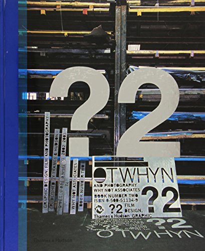
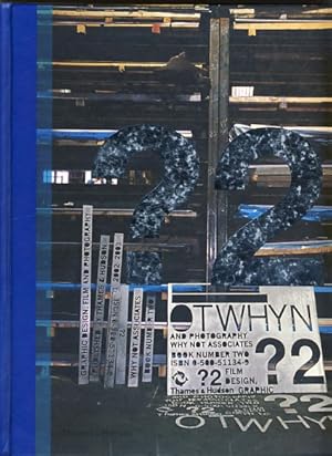
Hardcover. Condition: new. Hardcover. Tat* is a bit of a graphic designer's curse. Walk into any design studio and you will see tat pinned to the walls or placed with loving care on top of a computer screen. Even the purist will have a secret cache hidden away somewhere. Andy Altmann began collecting tat while he was on his Foun…dation course, getting ready for an interview at St Martins School of Art. He'd been asked to present a sketchbook, but worried that he couldn't draw very well, he decided to start a scrapbook: "I rummaged through the drawers at home and found some football cards from the late 1960s and early '70s (plenty of Georgie Best), an instruction leaflet from an old Hoover, Christmas cracker jokes, and so on. Then I started on the magazines, cutting out images of anything that interested me. And finally I took myself off to the college library, where I photocopied things from books before reaching for the scissors and glue." It was the beginning of a significant collecting habit. So what it is that makes a piece of graphic tat interesting? Is it the 'retro' thing - a fascination with a bygone age, the primitive printing techniques, the naivety of the design, or the use of colour? All of the above, of course, but it's not quite that simple. To a graphic designer, most of the content of this book can safely be regarded as 'bad' design. But there is some magic in each and every piece that has made Andy either pick it up off the street, trail through online links, or enter some dodgy looking shop on the other side of the world just to snap it up. Here you'll find everything from sweet wrappers to flash cards, from soap powder boxes to speedway flyers, from wrestling programmes to bus tickets. More tat than you can shake a stick at. Taken together, it represents a lifetime of gleeful hunting and gathering. * tat (noun) - anything that looks cheap, is of low quality, or in bad condition; junk, rubbish, debris, detritus, crap, shite AUTHOR: Andy Altmann is a founding partner at Why Not Associates - one of the UK's leading multi-disciplinary design companies. Andy founded Why Not Associates in 1987, with fellow Royal College of Art graduates David Ellis and Howard Greenhalgh. Although he trained as a graphic designer, Andy's work has taken him into the blurred boundaries of design and art. In over 30 years of experience he has worked on projects ranging from exhibition design to postage stamps, via advertising, publishing, television titles, commercials, corporate identity and large-scale public art. His clients include the Royal Academy of Arts, Channel 4, V&A, Grace Jones, Pompidou Centre, Royal Mail, Nike, Paul Smith, Chris Ofili, Kobe Museum of Fashion and Tate Modern. 400 colour images A source book of inspirational graphic ephemera, as collected over the past 30 years by designer Andy Altmann of Why Not Associates. Shipping may be from multiple locations in the US or from the UK, depending on stock availability.
- Hardcover
Seller: Ria Christie Collections, Uxbridge, United KingdomRia Christie Collections
Contact seller5-star sellerCondition: New
US$ 56.02
US$ 16.11 shippingShips from United Kingdom to U.S.A.Quantity: Over 20 available
Condition: New. In.
- Hardcover
Seller: Chiron Media, Wallingford, United KingdomChiron Media
Contact seller5-star sellerCondition: New
US$ 52.51
US$ 20.84 shippingShips from United Kingdom to U.S.A.Quantity: 2 available
hardcover. Condition: New.
- Hardcover
Seller: GreatBookPricesUK, Woodford Green, United KingdomGreatBookPricesUK
Contact seller5-star sellerCondition: Used - As new
US$ 54.80
US$ 20.18 shippingShips from United Kingdom to U.S.A.Quantity: Over 20 available
Condition: As New. Unread book in perfect condition.
- Hardcover
- First Edition
Seller: Kennys Bookshop and Art Galleries Ltd., Galway, GY, IrelandKennys Bookshop and Art Galleries Ltd.
Contact seller5-star sellerCondition: New
US$ 64.74
US$ 12.01 shippingShips from Ireland to U.S.A.Quantity: 2 available
Condition: New. 2021. 01st Edition. Hardcover. . . . . .

- Hardcover
Seller: Rarewaves USA, OSWEGO, IL, U.S.A.Rarewaves USA
Contact seller5-star sellerCondition: New
US$ 76.22
Free ShippingShips within U.S.A.Quantity: 1 available
Hardback. Condition: New. Tat* is a bit of a graphic designer's curse. Walk into any design studio and you will see tat pinned to the walls or placed with loving care on top of a computer screen. Even the purist will have a secret cache hidden away somewhere.Andy Altmann began collecting tat while he was on his Foundation course…, getting ready for an interview at St Martins School of Art. He'd been asked to present a sketchbook, but worried that he couldn't draw very well, he decided to start a scrapbook: "I rummaged through the drawers at home and found some football cards from the late 1960s and early '70s (plenty of Georgie Best), an instruction leaflet from an old Hoover, Christmas cracker jokes, and so on. Then I started on the magazines, cutting out images of anything that interested me. And finally I took myself off to the college library, where I photocopied things from books before reaching for the scissors and glue." It was the beginning of a significant collecting habit.So what it is that makes a piece of graphic tat interesting? Is it the 'retro' thing - a fascination with a bygone age, the primitive printing techniques, the naivety of the design, or the use of colour? All of the above, of course, but it's not quite that simple. "Occasionally people offer me something they've found that they think I might like", says Andy. "But usually they're wrong - it doesn't excite me at all. The magic is missing."To a graphic designer, most the content of this book can safely be regarded as 'bad' design. But there is some magic in each and every piece that has made Andy either pick it up off the street, trail through online links, or enter some dodgy looking shop on the other side of the world just to snap it up. Here you'll find everything from sweet wrappers to flash cards, from soap powder boxes to speedway flyers, from wrestling programmes to bus tickets. More tat than you can shake a stick at. Taken together, it represents a lifetime of gleeful hunting and gathering.* tat (noun) - anything that looks cheap, is of low quality, or in bad condition; junk, rubbish, debris, detritus, crap, shite.
- Hardcover
Seller: Pearlydewdrops, Streat, United KingdomPearlydewdrops
Contact seller5-star sellerCondition: Used - Fine
US$ 52.23
US$ 29.59 shippingShips from United Kingdom to U.S.A.Quantity: 1 available
hardcover. Condition: Fine. New & unread, however may have light shelf wear to cover face, edges or corners. Shipped from the UK within 2 business days of order being placed.
- Hardcover
Seller: Kennys Bookstore, Olney, MD, U.S.A.Kennys Bookstore
Contact seller5-star sellerCondition: New
US$ 75.00
US$ 10.50 shippingShips within U.S.A.Quantity: 2 available
Condition: New. 2021. 01st Edition. Hardcover. . . . . . Books ship from the US and Ireland.
- Hardcover
Seller: Revaluation Books, Exeter, United KingdomRevaluation Books
Contact seller5-star sellerCondition: New
US$ 67.89
US$ 26.90 shippingShips from United Kingdom to U.S.A.Quantity: 2 available
Hardcover. Condition: Brand New. 383 pages. 9.75x8.25x1.50 inches. In Stock.
- Hardcover
Seller: Speedyhen, Hertfordshire, United KingdomSpeedyhen
Contact seller5-star sellerCondition: New
US$ 48.24
US$ 55.15 shippingShips from United Kingdom to U.S.A.Quantity: 2 available
Condition: NEW.
- Hardcover
Seller: CitiRetail, Stevenage, United KingdomCitiRetail
Contact seller5-star sellerCondition: New
US$ 56.09
US$ 49.77 shippingShips from United Kingdom to U.S.A.Quantity: 1 available
Hardcover. Condition: new. Hardcover. Tat* is a bit of a graphic designer's curse. Walk into any design studio and you will see tat pinned to the walls or placed with loving care on top of a computer screen. Even the purist will have a secret cache hidden away somewhere. Andy Altmann began collecting tat while he was on his Foun…dation course, getting ready for an interview at St Martins School of Art. He'd been asked to present a sketchbook, but worried that he couldn't draw very well, he decided to start a scrapbook: "I rummaged through the drawers at home and found some football cards from the late 1960s and early '70s (plenty of Georgie Best), an instruction leaflet from an old Hoover, Christmas cracker jokes, and so on. Then I started on the magazines, cutting out images of anything that interested me. And finally I took myself off to the college library, where I photocopied things from books before reaching for the scissors and glue." It was the beginning of a significant collecting habit. So what it is that makes a piece of graphic tat interesting? Is it the 'retro' thing - a fascination with a bygone age, the primitive printing techniques, the naivety of the design, or the use of colour? All of the above, of course, but it's not quite that simple. To a graphic designer, most of the content of this book can safely be regarded as 'bad' design. But there is some magic in each and every piece that has made Andy either pick it up off the street, trail through online links, or enter some dodgy looking shop on the other side of the world just to snap it up. Here you'll find everything from sweet wrappers to flash cards, from soap powder boxes to speedway flyers, from wrestling programmes to bus tickets. More tat than you can shake a stick at. Taken together, it represents a lifetime of gleeful hunting and gathering. * tat (noun) - anything that looks cheap, is of low quality, or in bad condition; junk, rubbish, debris, detritus, crap, shite AUTHOR: Andy Altmann is a founding partner at Why Not Associates - one of the UK's leading multi-disciplinary design companies. Andy founded Why Not Associates in 1987, with fellow Royal College of Art graduates David Ellis and Howard Greenhalgh. Although he trained as a graphic designer, Andy's work has taken him into the blurred boundaries of design and art. In over 30 years of experience he has worked on projects ranging from exhibition design to postage stamps, via advertising, publishing, television titles, commercials, corporate identity and large-scale public art. His clients include the Royal Academy of Arts, Channel 4, V&A, Grace Jones, Pompidou Centre, Royal Mail, Nike, Paul Smith, Chris Ofili, Kobe Museum of Fashion and Tate Modern. 400 colour images A source book of inspirational graphic ephemera, as collected over the past 30 years by designer Andy Altmann of Why Not Associates. Shipping may be from our UK warehouse or from our Australian or US warehouses, depending on stock availability.
- Hardcover
Seller: AussieBookSeller, Truganina, VIC, AustraliaAussieBookSeller
Contact seller5-star sellerCondition: New
US$ 78.92
US$ 37.00 shippingShips from Australia to U.S.A.Quantity: 1 available
Hardcover. Condition: new. Hardcover. Tat* is a bit of a graphic designer's curse. Walk into any design studio and you will see tat pinned to the walls or placed with loving care on top of a computer screen. Even the purist will have a secret cache hidden away somewhere. Andy Altmann began collecting tat while he was on his Foun…dation course, getting ready for an interview at St Martins School of Art. He'd been asked to present a sketchbook, but worried that he couldn't draw very well, he decided to start a scrapbook: "I rummaged through the drawers at home and found some football cards from the late 1960s and early '70s (plenty of Georgie Best), an instruction leaflet from an old Hoover, Christmas cracker jokes, and so on. Then I started on the magazines, cutting out images of anything that interested me. And finally I took myself off to the college library, where I photocopied things from books before reaching for the scissors and glue." It was the beginning of a significant collecting habit. So what it is that makes a piece of graphic tat interesting? Is it the 'retro' thing - a fascination with a bygone age, the primitive printing techniques, the naivety of the design, or the use of colour? All of the above, of course, but it's not quite that simple. To a graphic designer, most of the content of this book can safely be regarded as 'bad' design. But there is some magic in each and every piece that has made Andy either pick it up off the street, trail through online links, or enter some dodgy looking shop on the other side of the world just to snap it up. Here you'll find everything from sweet wrappers to flash cards, from soap powder boxes to speedway flyers, from wrestling programmes to bus tickets. More tat than you can shake a stick at. Taken together, it represents a lifetime of gleeful hunting and gathering. * tat (noun) - anything that looks cheap, is of low quality, or in bad condition; junk, rubbish, debris, detritus, crap, shite AUTHOR: Andy Altmann is a founding partner at Why Not Associates - one of the UK's leading multi-disciplinary design companies. Andy founded Why Not Associates in 1987, with fellow Royal College of Art graduates David Ellis and Howard Greenhalgh. Although he trained as a graphic designer, Andy's work has taken him into the blurred boundaries of design and art. In over 30 years of experience he has worked on projects ranging from exhibition design to postage stamps, via advertising, publishing, television titles, commercials, corporate identity and large-scale public art. His clients include the Royal Academy of Arts, Channel 4, V&A, Grace Jones, Pompidou Centre, Royal Mail, Nike, Paul Smith, Chris Ofili, Kobe Museum of Fashion and Tate Modern. 400 colour images A source book of inspirational graphic ephemera, as collected over the past 30 years by designer Andy Altmann of Why Not Associates. Shipping may be from our Sydney, NSW warehouse or from our UK or US warehouse, depending on stock availability.

- Hardcover
Seller: moluna, Greven, Germanymoluna
Contact seller5-star sellerCondition: New
US$ 62.30
US$ 56.04 shippingShips from Germany to U.S.A.Quantity: 2 available
Gebunden. Condition: New. A source book of inspirational graphic ephemera, as collected over the past 30 years by designer Andy Altmann of Why Not Associates.Über den AutorAndy Altmann is a founding partner at Why Not Associates - one of the UK s leading.
- Hardcover
Seller: Books+, Saint Maurice, FranceBooks+
Contact seller5-star sellerCondition: Used
US$ 117.83
US$ 10.30 shippingShips from France to U.S.A.Quantity: 1 available
In-4, 30 cm, 208pp., 1500 illustr. en couleurs, reliure cart. de l'editeur.

- Hardcover
Seller: Rarewaves USA United, OSWEGO, IL, U.S.A.Rarewaves USA United
Contact seller5-star sellerCondition: New
US$ 80.72
US$ 50.00 shippingShips within U.S.A.Quantity: 1 available
Hardback. Condition: New. Tat* is a bit of a graphic designer's curse. Walk into any design studio and you will see tat pinned to the walls or placed with loving care on top of a computer screen. Even the purist will have a secret cache hidden away somewhere.Andy Altmann began collecting tat while he was on his Foundation course…, getting ready for an interview at St Martins School of Art. He'd been asked to present a sketchbook, but worried that he couldn't draw very well, he decided to start a scrapbook: "I rummaged through the drawers at home and found some football cards from the late 1960s and early '70s (plenty of Georgie Best), an instruction leaflet from an old Hoover, Christmas cracker jokes, and so on. Then I started on the magazines, cutting out images of anything that interested me. And finally I took myself off to the college library, where I photocopied things from books before reaching for the scissors and glue." It was the beginning of a significant collecting habit.So what it is that makes a piece of graphic tat interesting? Is it the 'retro' thing - a fascination with a bygone age, the primitive printing techniques, the naivety of the design, or the use of colour? All of the above, of course, but it's not quite that simple. "Occasionally people offer me something they've found that they think I might like", says Andy. "But usually they're wrong - it doesn't excite me at all. The magic is missing."To a graphic designer, most the content of this book can safely be regarded as 'bad' design. But there is some magic in each and every piece that has made Andy either pick it up off the street, trail through online links, or enter some dodgy looking shop on the other side of the world just to snap it up. Here you'll find everything from sweet wrappers to flash cards, from soap powder boxes to speedway flyers, from wrestling programmes to bus tickets. More tat than you can shake a stick at. Taken together, it represents a lifetime of gleeful hunting and gathering.* tat (noun) - anything that looks cheap, is of low quality, or in bad condition; junk, rubbish, debris, detritus, crap, shite.
- Hardcover
Seller: Leserstrahl (Preise inkl. MwSt.), Oldenbüttel, GermanyLeserstrahl (Preise inkl. MwSt.)
Contact seller5-star sellerCondition: Used - Fine
US$ 9.38
US$ 120.12 shippingShips from Germany to U.S.A.Quantity: 1 available
Hardcover. Condition: Fine. 0002. wie ungelesen, geringe Lagerspuren---. nein.
- Hardcover
Seller: Borkert, Schwarz und Zerfaß GbR, Berlin, GermanyBorkert, Schwarz und Zerfaß GbR
Contact seller5-star sellerCondition: Used - Fine
US$ 15.91
US$ 45.76 shippingShips from Germany to U.S.A.Quantity: 1 available
Condition: Sehr gut. 208 S. Ein gutes und sauberes Exemplar. - Projects: powerhouse::uk, making an angel, satellite media services, paul smith, adidas, the poetry society, macuser, hunt and gather, voyages of discovery, om, plazm, plymouth, scan, virgin 1999, eric morecambe, vasili kandinsky, joseph beuys, malcolm mclaren, quart…er, ultraman, don't recycle it, wash it, postcards from the net, one more kiss, virgin april 2000, london arts, bbc radio four cricket, archer street, virgin june 2000, apocalypse, nike euro 2000, bite, leap, niketown, cursing stone and reiver pavement, virgin 2001, city mesto, ncr, banks ide walkway, under my skin, blue, smart, lincoln, walk of art, still slow divided, the trust, guide to ecstacity, white, a flock of words. ISBN 9780500511343 Sprache: Deutsch Gewicht in Gramm: 1550 Mit zahlr. farb. Abb. Gebundene Ausgabe.

- Hardcover
Seller: AHA-BUCH GmbH, Einbeck, GermanyAHA-BUCH GmbH
Contact seller5-star sellerCondition: New
US$ 66.28
US$ 78.00 shippingShips from Germany to U.S.A.Quantity: 1 available
Buch. Condition: Neu. Neuware - Tat\* is a bit of a graphic designer's curse. Walk into any design studio and you will see tat pinned to the walls or placed with loving care on top of a computer screen. Even the purist will have a secret cache hidden away somewhere. Andy Altmann began collecting tat while he was on his Foundatio…n course, getting ready for an interview at St Martins School of Art. He'd been asked to present a sketchbook, but worried that he couldn't draw very well, he decided to start a scrapbook: 'I rummaged through the drawers at home and found some football cards from the late 1960s and early '70s (plenty of Georgie Best), an instruction leaflet from an old Hoover, Christmas cracker jokes, and so on. Then I started on the magazines, cutting out images of anything that interested me. And finally I took myself off to the college library, where I photocopied things from books before reaching for the scissors and glue.' It was the beginning of a significant collecting habit. So what it is that makes a piece of graphic tat interesting Is it the 'retro' thing - a fascination with a bygone age, the primitive printing techniques, the naivety of the design, or the use of color All of the above, of course, but it's not quite that simple. 'Occasionally people offer me something they've found that they think I might like', says Andy. 'But usually they're wrong - it doesn't excite me at all. The magic is missing.' To a graphic designer, most the content of this book can safely be regarded as 'bad' design. But there is some magic in each and every piece that has made Andy either pick it up off the street, trail through online links, or enter some dodgy looking shop on the other side of the world just to snap it up. Here you'll find everything from sweet wrappers to flash cards, from soap powder boxes to speedway flyers, from wrestling programmes to bus tickets. More tat than you can shake a stick at. Taken together, it represents a lifetime of gleeful hunting and gathering. \* tat (noun) - anything that looks cheap, is of low quality, or in bad condition; junk, rubbish, debris, detritus, crap, shite.

- Hardcover
Seller: Rarewaves.com UK, London, United KingdomRarewaves.com UK
Contact seller5-star sellerCondition: New
US$ 61.78
US$ 87.43 shippingShips from United Kingdom to U.S.A.Quantity: Over 20 available
Hardback. Condition: New. Tat* is a bit of a graphic designer's curse. Walk into any design studio and you will see tat pinned to the walls or placed with loving care on top of a computer screen. Even the purist will have a secret cache hidden away somewhere.Andy Altmann began collecting tat while he was on his Foundation course…, getting ready for an interview at St Martins School of Art. He'd been asked to present a sketchbook, but worried that he couldn't draw very well, he decided to start a scrapbook: "I rummaged through the drawers at home and found some football cards from the late 1960s and early '70s (plenty of Georgie Best), an instruction leaflet from an old Hoover, Christmas cracker jokes, and so on. Then I started on the magazines, cutting out images of anything that interested me. And finally I took myself off to the college library, where I photocopied things from books before reaching for the scissors and glue." It was the beginning of a significant collecting habit.So what it is that makes a piece of graphic tat interesting? Is it the 'retro' thing - a fascination with a bygone age, the primitive printing techniques, the naivety of the design, or the use of colour? All of the above, of course, but it's not quite that simple. "Occasionally people offer me something they've found that they think I might like", says Andy. "But usually they're wrong - it doesn't excite me at all. The magic is missing."To a graphic designer, most the content of this book can safely be regarded as 'bad' design. But there is some magic in each and every piece that has made Andy either pick it up off the street, trail through online links, or enter some dodgy looking shop on the other side of the world just to snap it up. Here you'll find everything from sweet wrappers to flash cards, from soap powder boxes to speedway flyers, from wrestling programmes to bus tickets. More tat than you can shake a stick at. Taken together, it represents a lifetime of gleeful hunting and gathering.* tat (noun) - anything that looks cheap, is of low quality, or in bad condition; junk, rubbish, debris, detritus, crap, shite.

- Hardcover
Seller: preigu, Osnabrück, Germanypreigu
Contact seller5-star sellerCondition: New
US$ 70.17
US$ 80.08 shippingShips from Germany to U.S.A.Quantity: 1 available
Buch. Condition: Neu. TAT* | Inspirational Graphic Ephemera | Andy Altmann | Buch | Gebunden | Englisch | 2021 | ACC Art Books - IPSUK | EAN 9781911422273 | Verantwortliche Person für die EU: Libri GmbH, Europaallee 1, 36244 Bad Hersfeld, gpsr[at]libri[dot]de | Anbieter: preigu.
 More images
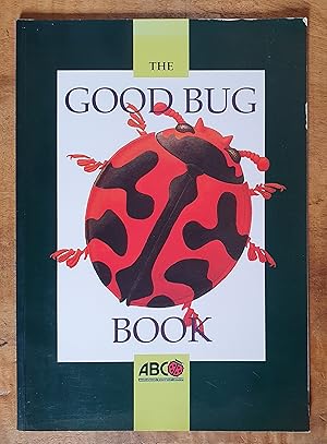
THE GOOD BUG BOOK: Beneficial Insects and Mites Commercially Available in Australia for Biological Pest Control
PAPACEK, Dan; LLEWELLYN, Richard; ALTMANN, James; RYLAND, Andy & SEYMOUR Jamie
Published by Australasian Biological Contol; Department of Primary Industries Queensland; Rural Industries Research & Development Corp, Australia, 1995
- Softcover
Seller: Uncle Peter's Books, Clunes, NSW, AustraliaUncle Peter's Books
Contact seller5-star sellerCondition: Used - Good
US$ 32.36
US$ 52.00 shippingShips from Australia to U.S.A.Quantity: 1 available
Soft cover. Condition: Good. " A valuable resource for crop growers, agricultural and horticultural advisers and consultants, students and teachers of agriculture and horticulture." Covers are handled with the odd scuff and impression. Page edges are clean, yet show some light discolouration. Binding tidy. Corners are thumbed. A…ll plates present, clear and in colour. This book is in good condition. *We always describe the faults of our books meticulously; they usually present better than they sound.


